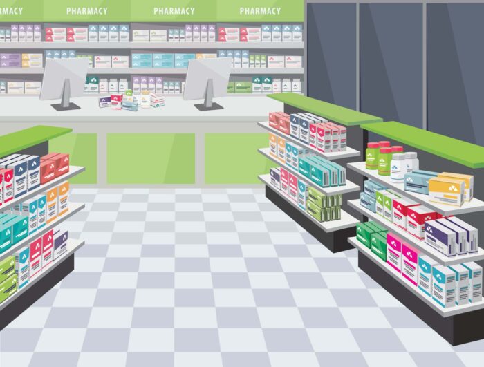
Retailers have been doing it for ages, arranging their shop and shelves to influence their customers in buying more and of course become a loyal client.
Pharmacies can use the same knowledge of retail to optimize their (often limited) space. As Meditech already helps to arrange your back-office with our pharmacy robots, we also want to give you some tips for your shopping area.
Rule 1: Use planograms
A planogram is a roadmap of your pharmacy that displays the correct placement of products. It will show for example :
- The different sizes of packaging on the shelves.
- The positioning of competing products in certain areas.
- The number of products on the shelves according to popularity.
Rule 2: Use the planogram to analyse your patient behaviour
With the use of your planogram, you can easily spot the most popular products and certain customer behaviours. Maybe you’ve used a lot of space in your pharmacy for a product that is not popular? Your planogram is a great visualisation of where you can make switches to optimize your pharmacy space.
Rule 3: Divide your pharmacy into ‘cold’ and ‘hot zones’
Retail already has proven that customers tend to turn right when they enter a store. It will not be different in your pharmacy. This ‘hot zone’ is where you put high-priced and high-margin products.

You can make your ‘hot zones’ even hotter by using digital screens to display promotion videos, product displays,… Our MT.VISION screens can also upgrade your shopping window.
The central area is the ‘warm zone’ where you can place seasonal goods, cosmetics & dietary supplements.
The ‘cold zones’ are more in the corner of your pharmacy and are perfect for those unpopular products.
Of course, your patients will most often come for advice and medicines, so keep in mind that your counter must be visible or that there is a clear path to it.
Rule 4: the merchandising of emotions
Emotions are often an important factor in customer behaviour and this is no different for pharmacy patients. When you enter a pharmacy that breathes a friendly and relaxing atmosphere, you will immediately be at ease. You will need to find the right balance between some colour & too much colour because, in the end, you’re still a professional health care provider.
As some free sale products like cosmetics are perfect for testing, why not create a comfy testing area in your pharmacy?
Rule 5: Merchandise display in the pharmacy
Firstly, pay attention to price tags and the display of the name of the medicine/product.
Secondly, make sure that the best-selling products are at eye level in a hot zone of your pharmacy. Your planogram is the perfect tool to help.
Thirdly, divide your pharmacy space into themes or categories. This will help your patient to navigate through your pharmacy. Allocate product groups so that customers can move from one category to the next – for example, maternity next to baby products. Pay attention to the so-called “spontaneous shopping zone”- the area near the cash register and in the aisles.
Want to learn more about how our products can help with optimizing your space?
